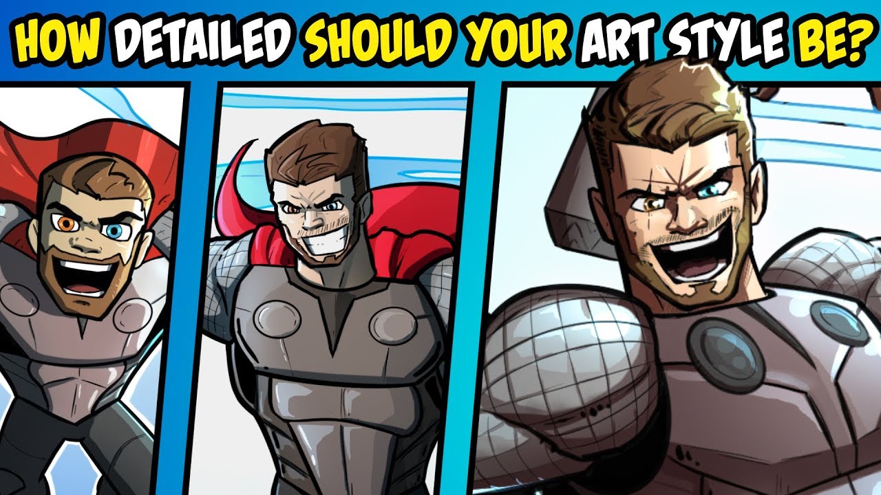
 Lots of people talk about finding your style or looking for your style and while I think its awesome to be on the hunt to find a style that well represents you as an artist, I think an important part of designing a style is designing one for a specific project.
 Different projects often require differing levels of detail. Also, your skills and abilities for a project can limit you from doing as detailed of a style as you want, but that shouldn't limit you from making the comics, cartoons or animations that you want to make.
A few years back I made a book series called Multiverse Tales and I knew I wasn't a good enough artist to make it a full fledged graphic novel or comic book with well detailed characters. So, I leaned into my strengths as an animator and made the characters simpler and more cartoony. While the project from a money making standpoint was a failure, to this day it's one of my favourite endeavours I've undertaken as an artist because of how much I learned and grew from it as an artist. Failure can be your best teacher sometimes.
So in this episode of PopCross Studios I give my thoughts, advice and tips for designing an art style for a specific project, whether that be a comic, animation or whatever. Also draw Thor in different levels of detail, twice with Mjolnir and once with Stormbreaker. One image is done as if it were na interior comic panel, one as if for a comic cover and one in my old Multiverse Tales art style.
Also, here is Neil Fontaine's course on Anatomy. It's VERY HELPFUL!!!
Submit artwork to the Characters-for-Pop Channel in the Discord!
DISCORD:
Instagram:
Check out some of my other Drawing and Animation videos!
Ninja Turtles x Star Wars Mashups
Redrawing Subscriber Super-Villains!
Tips for Dynamic Poses (ft. Spider-man Far From Home)
Pokemon as a Side-scroller (Animation)
Animating a Motion Poster for ZHC


0 Yorumlar